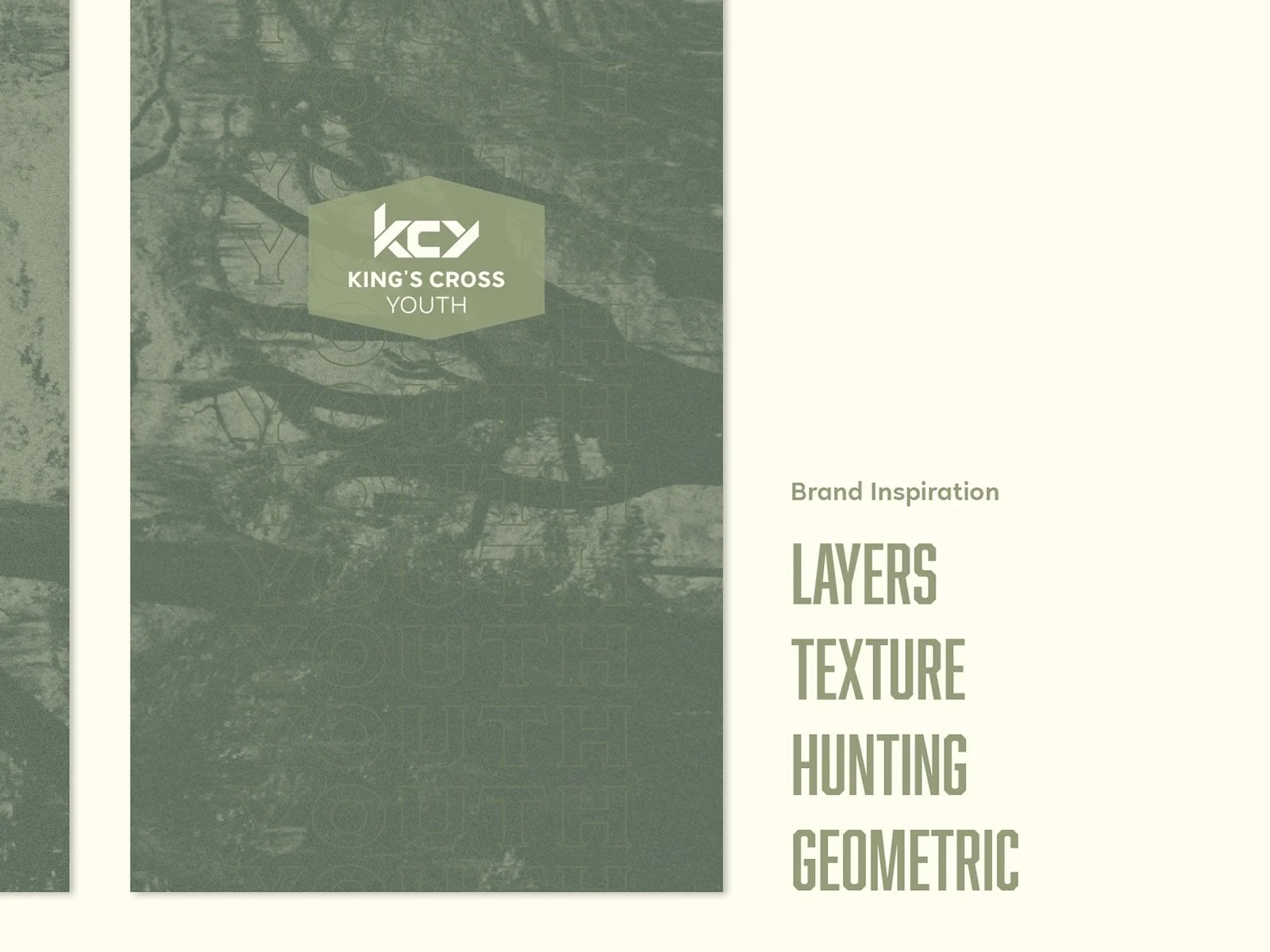
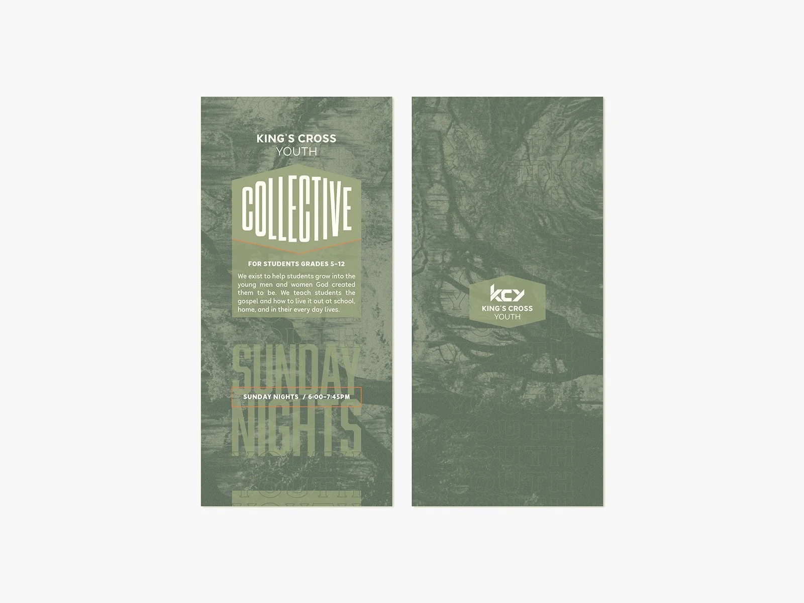
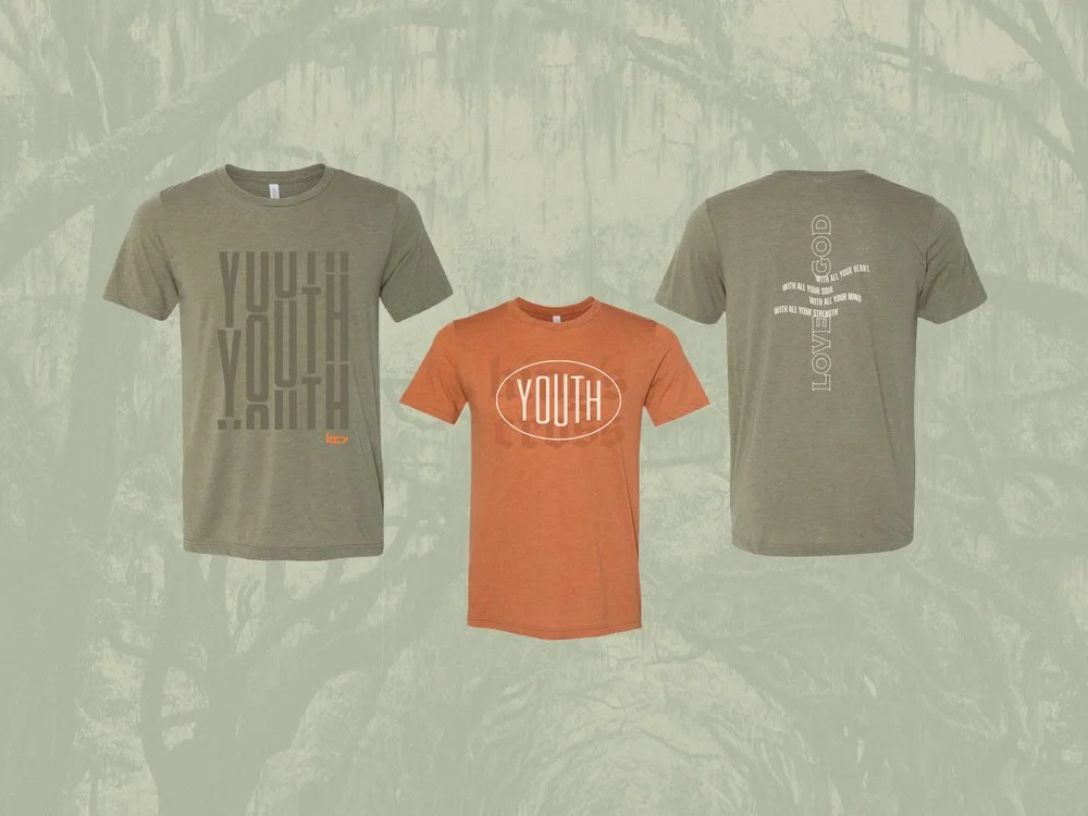
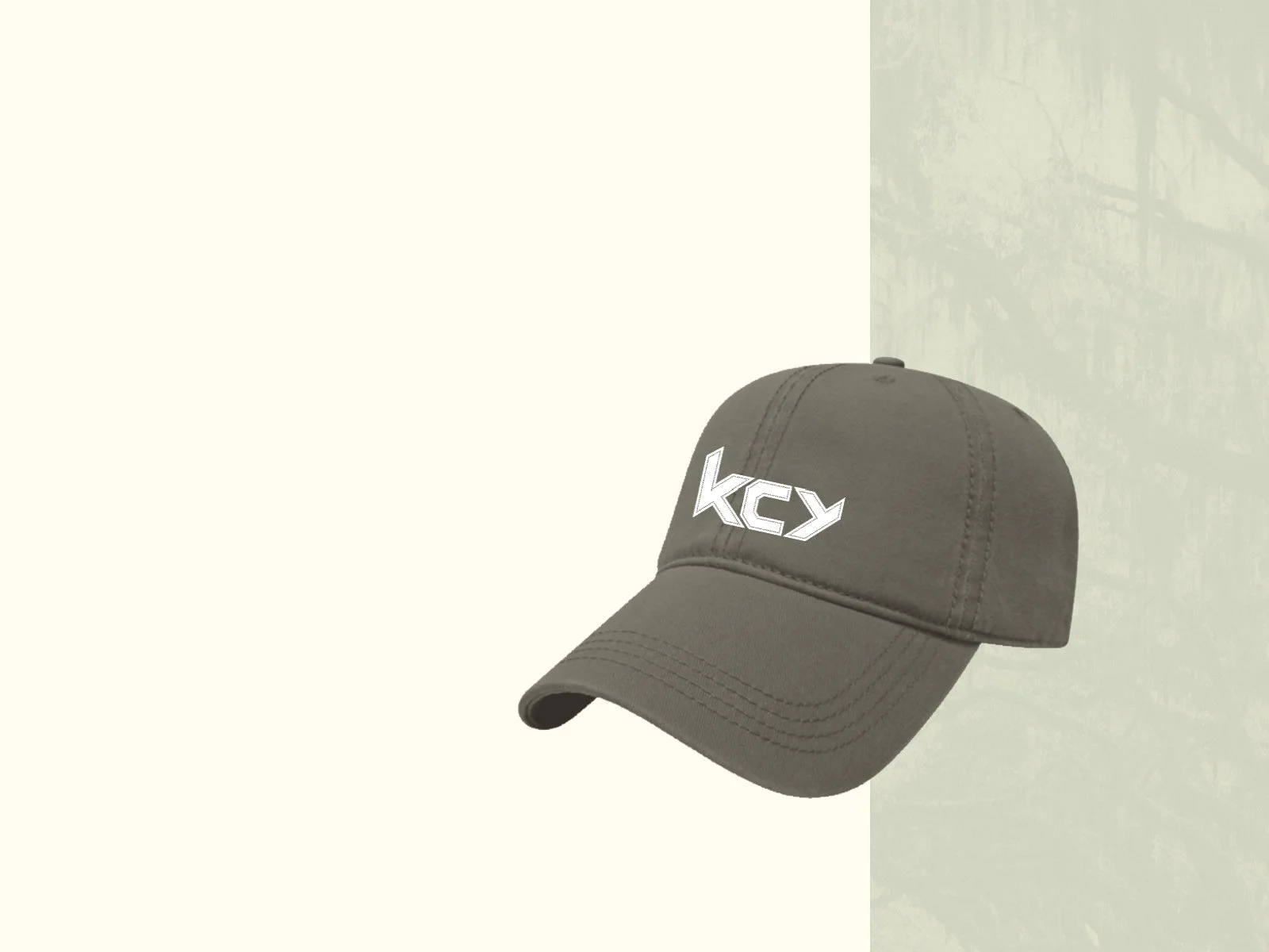
Kings Cross Youth
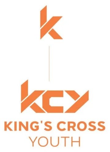
Challenge
Create a logo that fits in their main logo and make the branding youthful and masculine.
Solution
Use elements of their already existing logo and tweak it to work for KCY. The uniqueness came into play with their branding elements. The “Y” is repurposed from the “K”. The negative space creates a forward-facing arrow symbolizing the next generation.